Scan Report Redesign
Making complex security data easier to understand
Role: Product Designer Product: Netsparker Enterprise (web security scanner) Tools: Figma, interactive prototypes Research: Customer feedback, technical support insights, Pendo click data, customer prototype testing
The Problem
Netsparker Enterprise scans websites and finds security problems. After a scan, users get a report. This report is not just a list. It is a workspace. Users need to:
Find the most critical problems first
Read technical details
Check if a problem is real or already fixed
Take action on each issue
The old Scan Report had a large summary area at the top of the page — severity counts, a remediation score, and a short risk message. This took up a lot of space before users could even start reviewing issues.
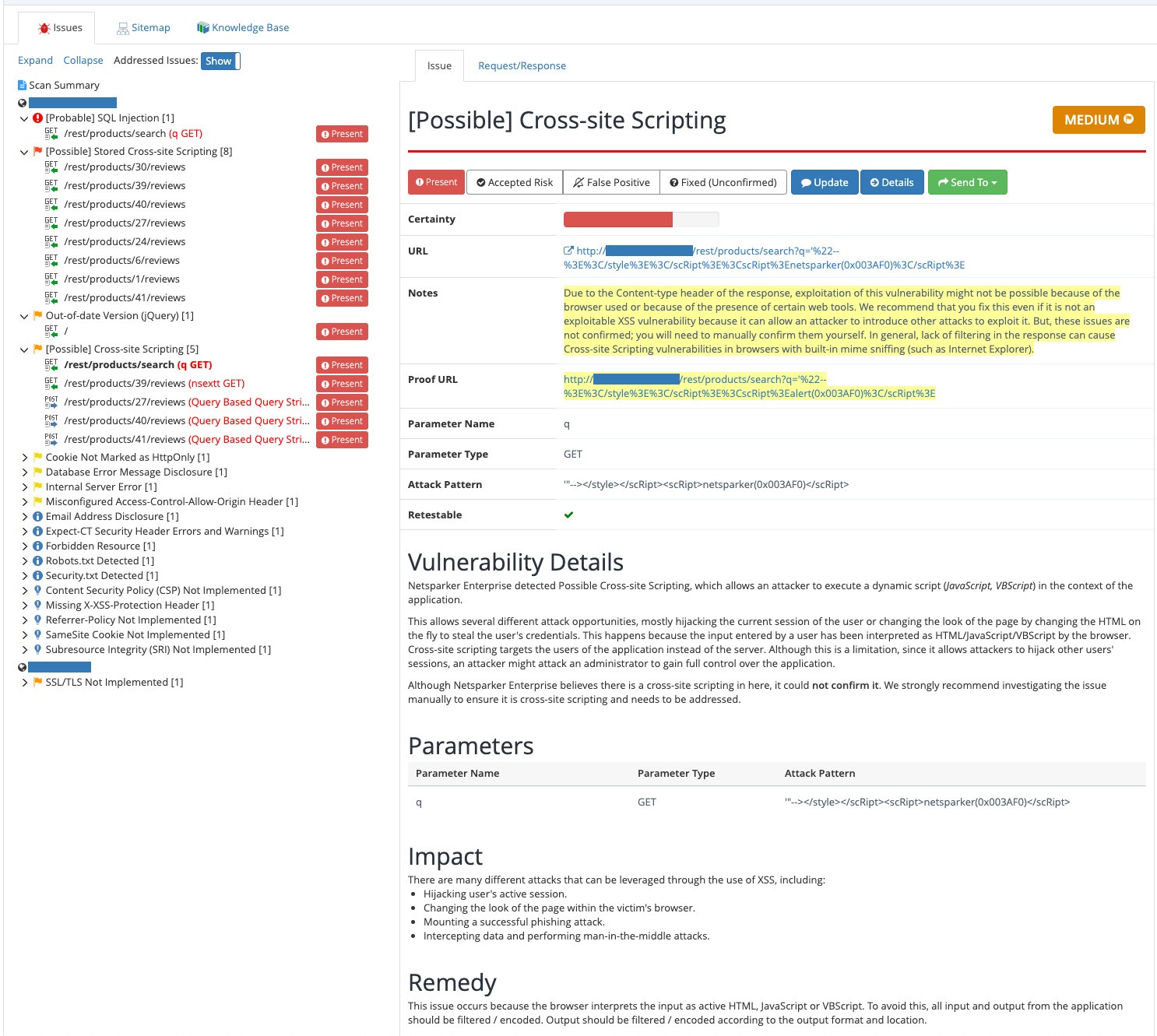 |
Below that, the layout had an issue list on the left and a long issue detail page on the right. The action buttons — Present, Accepted Risk, False Positive, Fixed — sat at the very top of this detail area. But the detail page itself was long: certainty, URL, notes, proof URL, technical details, impact, remedy. As users scrolled down to read this content, the action buttons scrolled out of view. To mark an issue as fixed or false positive, users had to scroll all the way back up.
This made the report feel slow and disconnected, especially in long reports with many issues.
(OLD INTERFACE — full screenshot) Caption: The old Scan Report. A large summary area sits at the top, pushing the actual issue review further down the page.
My question was simple: How can I help users find critical issues faster and understand them with less effort?
Research: Listening Before Designing
I did not want to guess. So I used three sources of information together.
1. Customer feedback I read customer comments saved in Confluence. This showed me what users said in their own words.
2. Technical support team I talked with the support team. They told me which problems came up again and again. This gave me context that customer comments alone could not give.
3. Pendo click data I checked where users clicked most on the old page. This showed me where users looked. But click data alone could not tell me why they clicked, or if they finished their task. So I never used it alone — always together with the other two sources.
(OLD INTERFACE — close-up of the issue detail panel) Caption: Action buttons sat at the top. After scrolling through a long report, users had to scroll all the way back up to use them.
Four Design Principles
This research led to four design principles:
Make critical issues easy to find — better filters, clearer visual priority.
Keep the list and the details connected — no lost context when switching issues.
Keep information and actions close together — issue status should sit next to the issue, not in another column.
Keep technical details, but easier to scan — the goal was not to remove information, only to organize it better.
The Design Solution
A more connected layout In the new design, the issue list and the issue details work as one connected area. When a user clicks a new issue, the details update in place. There is less scrolling and less jumping between screens.
(NEW INTERFACE — issue list + detail view) Caption: The new layout connects the list and the details, so users don't lose their place.
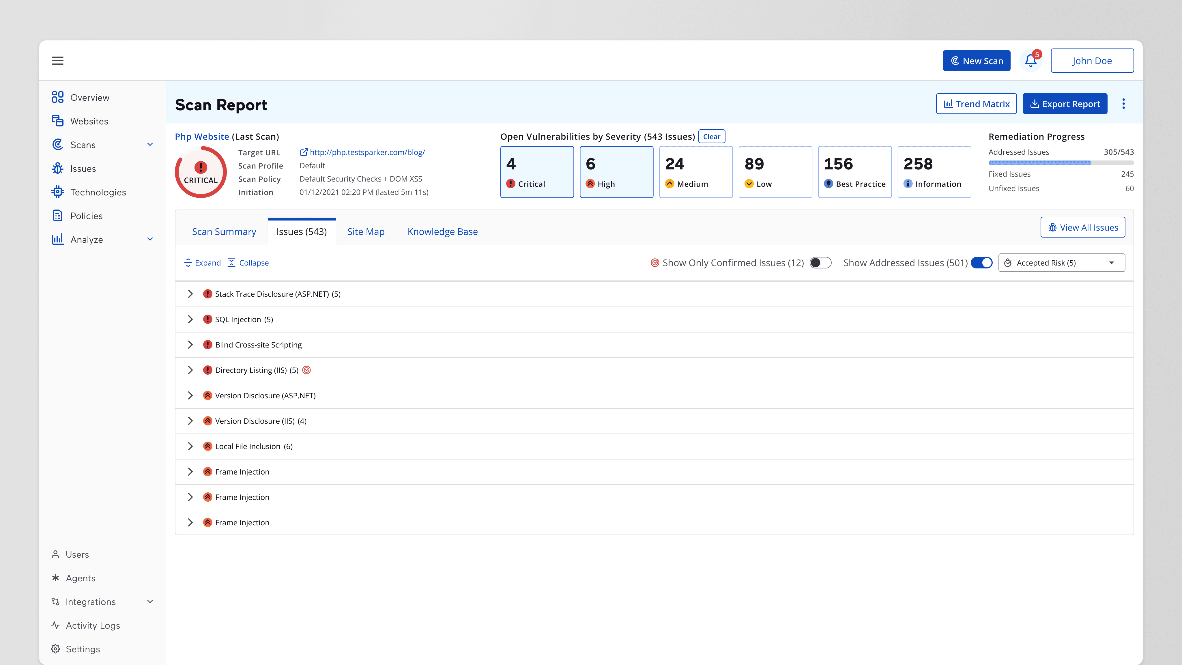
Faster access to critical issues I made severity filters more visible. Now users can filter by Critical or High and see only what matters most, right away.
(NEW INTERFACE — filter panel close-up) Caption: Clearer filters help users focus on high-priority issues first.
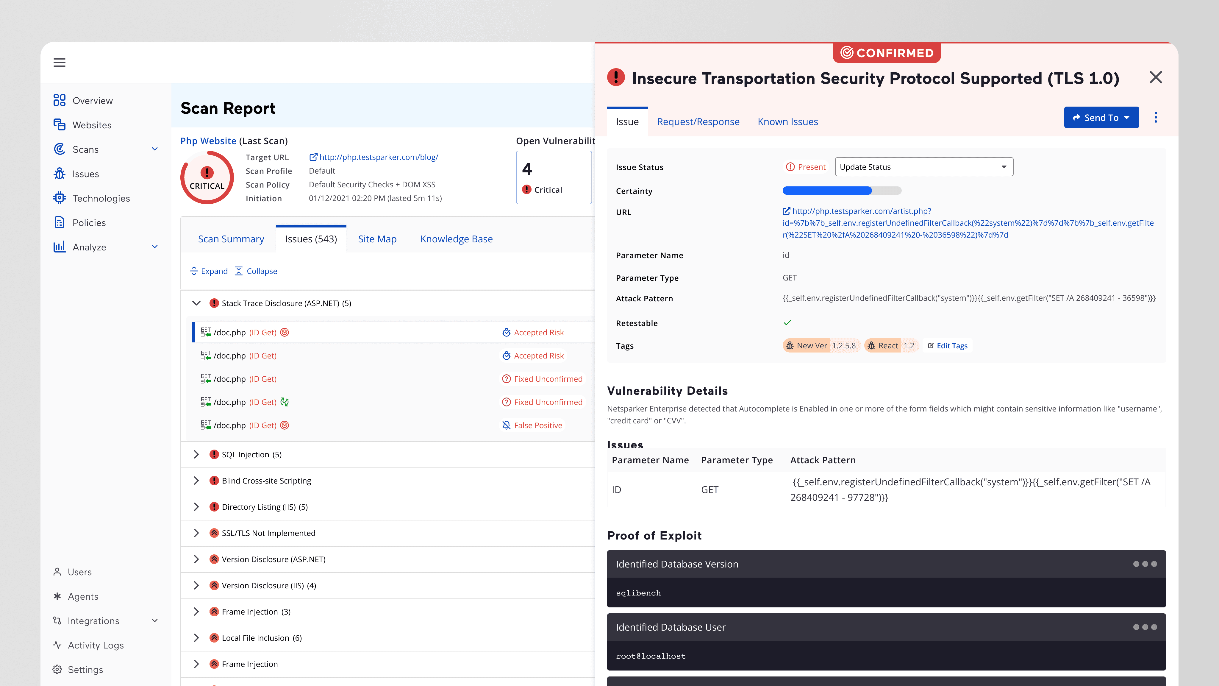
Issue status, moved closer to the action In the old design, "Issue Status" (Present, Accepted Risk, False Positive, Fixed) was in a separate column. In the new design, I moved it next to the issue details. Now users can read about a problem and manage it in the same place.
(NEW INTERFACE — issue status next to detail panel) Caption: Issue status now lives next to the issue details — read and act in one place.
A Decision I Changed My Mind About
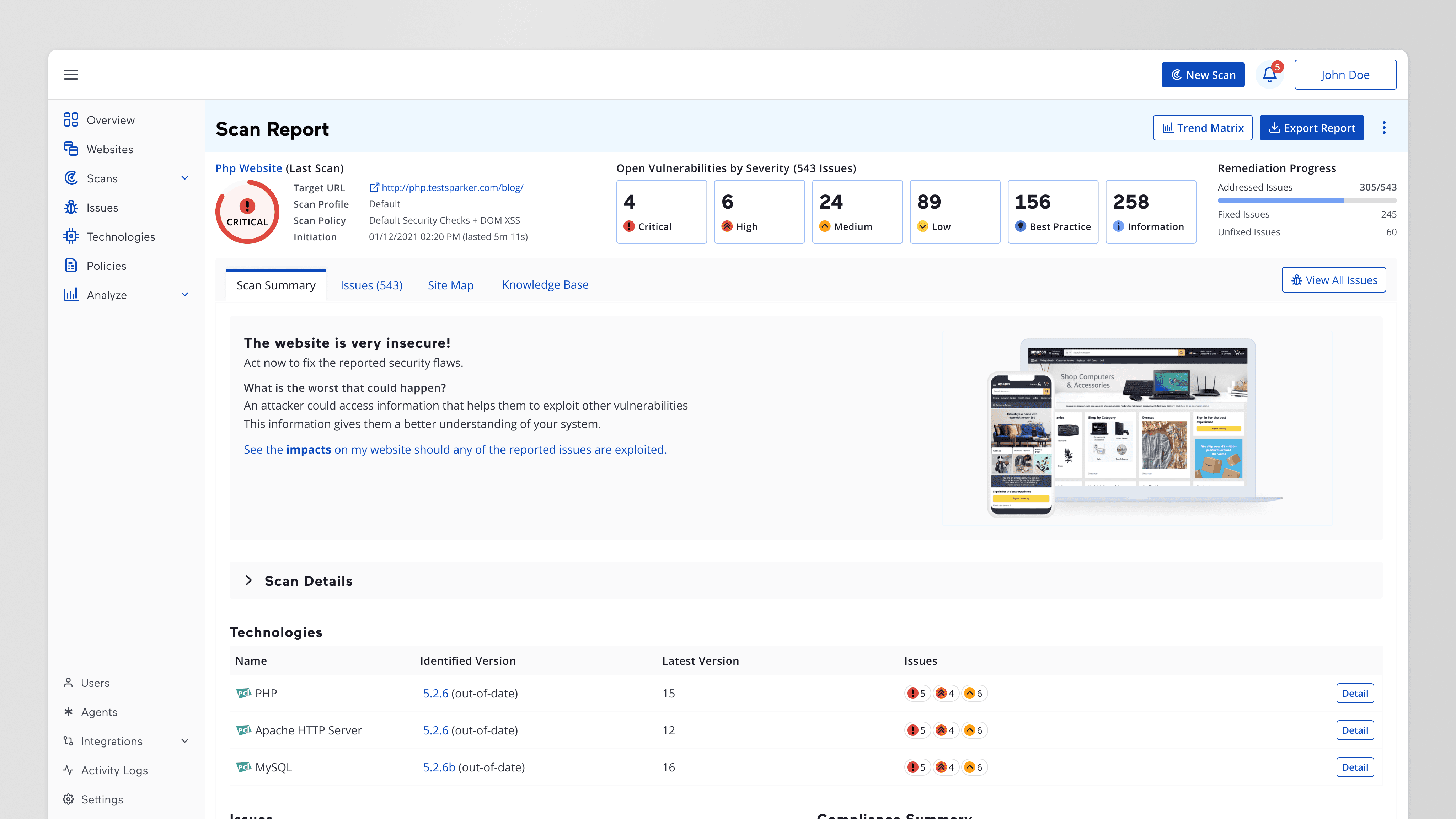
The Scan Summary section had a short, simple text explaining the scan results. At first, I removed it. I thought: "The report already shows all the details, so this text is not needed."
Later, I showed the design to senior stakeholders. They told me something important: this simple text was very useful for people with less technical knowledge. Not every user reads security reports every day.
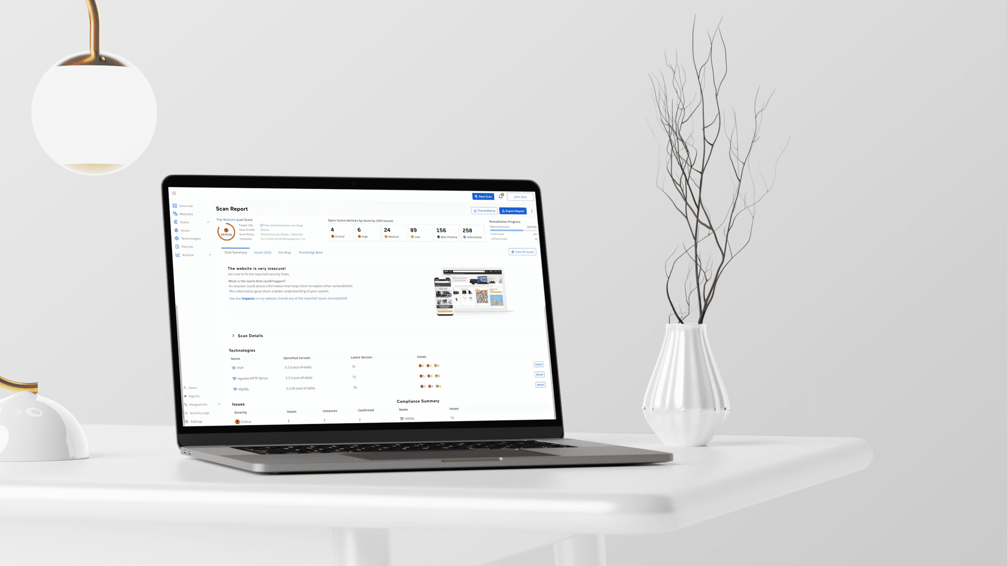
(NEW INTERFACE — Scan Summary section, desktop and mobile views) Caption: The short summary text stayed in the design — it helps less technical users understand the results.
I put the text back. This taught me something I still use today:
Before removing information, don't just ask "is this repeated?" Ask "who needs this, and why?"
Testing with Real Customers
I did not stop at static screens. I built an interactive prototype and used it in real meetings with customers. I watched how they:
Moved between issues
Used the new filters
Opened and read technical details
I used what I saw to improve the design step by step.
Honest note on results: We did not collect exact numbers, like "X% faster" or "X% fewer clicks." So I will not claim numbers I don't have. What I can say: customers described the new interface as cleaner, more modern, and easier to move around. This is qualitative feedback, not a measured result — and I think it's important to be clear about that difference.
I don't have confirmed information on whether this design was implemented in the live product after my involvement ended. (Fill in here if you know: e.g. "The design was handed off to engineering for implementation.")
What I Learned
Different research sources tell different stories. Customer comments show what people say. Support teams show where the pain really is. Click data shows behavior, not reasons. Together, they are much stronger than any one alone.
A decision that looks obvious can still be wrong. Removing the Scan Summary text seemed logical to me, but it wasn't right for every user. Testing assumptions with real stakeholders and users matters more than personal logic.
Being honest about missing data builds trust. I would rather say "I don't have numbers" than invent a claim I can't support.